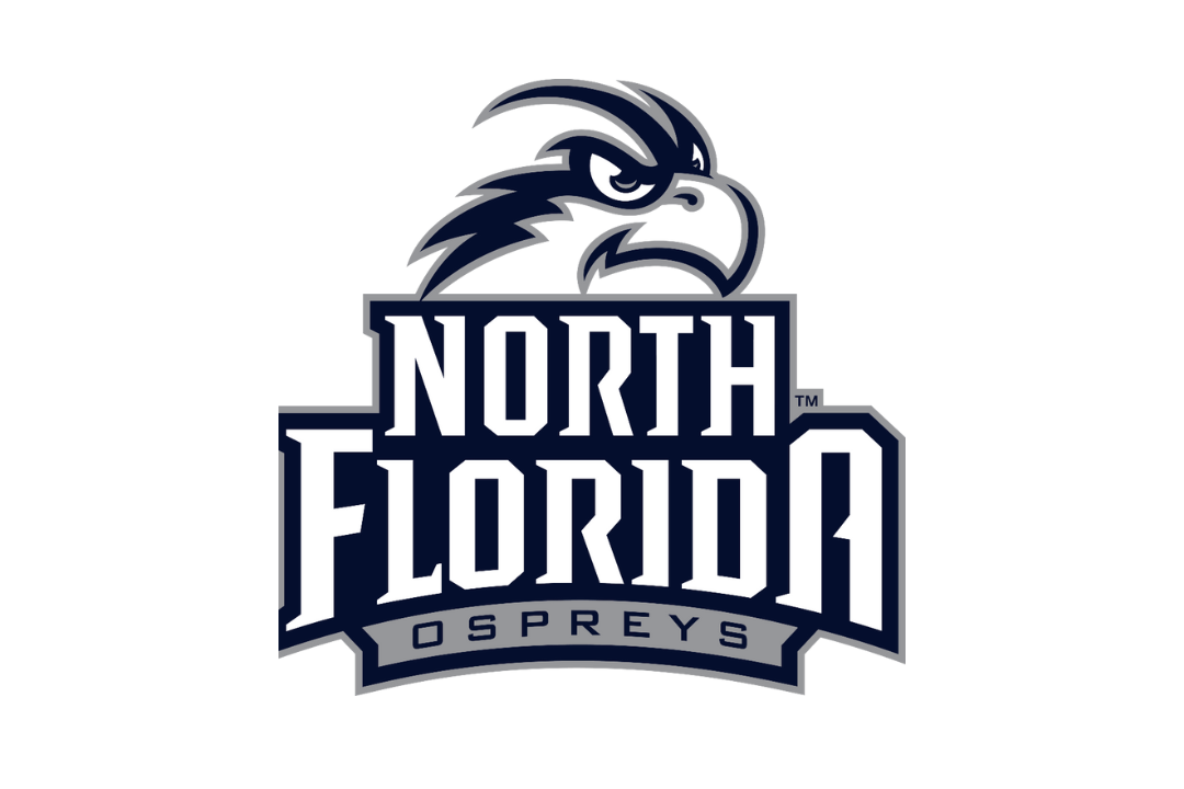

Lee Moon found the logo he wanted.
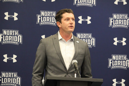
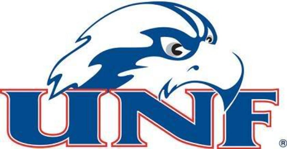
UNF athletics unveiled the new logo last week. Moon, UNF’s athletic director since 2009, was presented with many options for the image that would represent Osprey athletics for years to come. His decision will ultimately take over as the redesigned official brand for North Florida athletics.
“We were looking at a way to improve what our marks were and improve our brand,” Moon said. “Being able to have something that was clear, distinct, and consistent with who we are. It’s a really quality look.”
Moon added that he and his staff worked with a company called LRG Marketing, UNF’s partner and consultant during the process.
“They said they would provide us with the technical skills because they felt like they would enhance everything we do,” Moon said. “They felt like it was worth it to them and that it would be worth it to us.”
UNF Director of Athletic Marketing and Promotions Robert Harper and Associate Athletic Director of Finance and Administration Nick Morrow reviewed each logo presented, chose brands they liked, and presented them to Moon, who ultimately chose the final logo design.
“Some [logos] were really crazy,” Moon said. “We’d talk about which one I liked, which one they liked and get something we were really comfortable with.”
Moon said he and his staff made sure the colors were navy blue and gray, the font was consistent, and that there was a way to put the colors in front of gray, white, and blue backgrounds.
“We got rid of some things, like we changed a little bit with the Osprey head,” Moon said. “If you looked at the [old Osprey and new Osprey heads] side-by-side you’d say, ‘This is a really cool idea.’”
One thing Moon didn’t want to do was mimic the font presented in another university’s logo.
“I didn’t want to be like everybody else,” Moon said. “Just how it’s set up, it’s a little different, like the way the tails are on the ends of the letters. Some people have what they call moving letters, like they’re stretched out. I just wanted it to be clean and bold, and something that was eye appealing.”
The inspiration for the logo came from Moon’s expectations and parameters, and the choices by the designers to uniquely fill those parameters.
“We’re trying to brand North Florida,” Moon said. “We want people to know who we are and want them to wear our gear.”
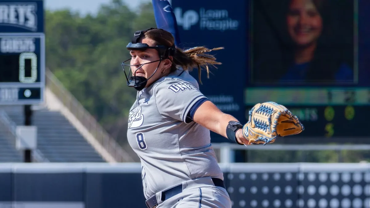
The new UNF logo has already received a vote of confidence from the two Osprey coaches with the most notoriety. Men’s basketball coach Matthew Driscoll and men’s soccer coach Derek Marinatos approved the uniformity and professionalism of the Ospreys’ new look.
“I was impressed,” Marinatos said. “It’s a big step forward.”
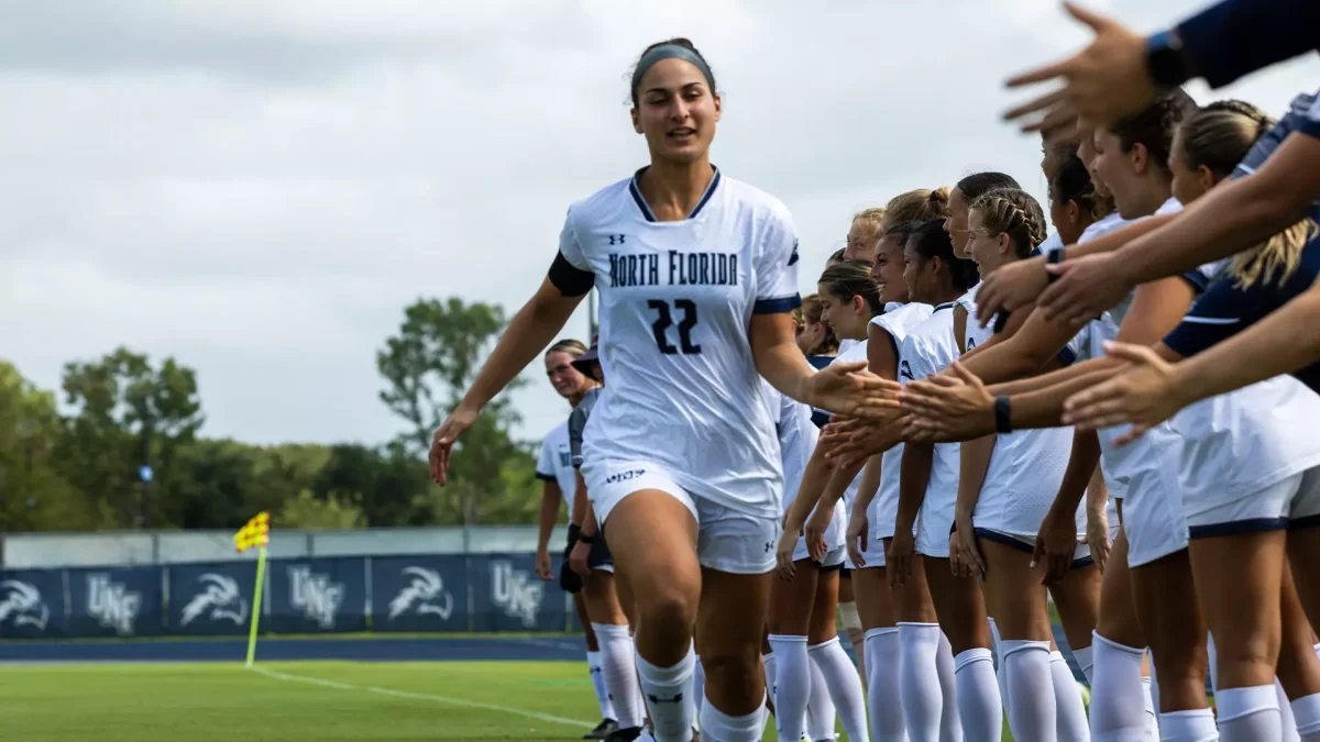
UNF previously featured several different logos, abbreviations for the “North Florida” school name and Osprey mascot styles on its uniforms, but now it seems that there is some stability to go along with the recent success of programs such as the men’s soccer and basketball teams.
“Anytime you can get people to be talking about you and what you’re doing, I think it’s great,” Driscoll said. “It’s an opportunity to put yourself out there and create a buzz.”
Driscoll said the basketball team wouldn’t be changing uniforms because his squad receives new uniforms every four years, and just got new uniforms last year.
Marinatos, however, didn’t rule out a uniform change due to the new logo.
“I don’t want to give away any surprises,” Marinatos said. “But we’re going to have the new logo on some new stuff.”
Marinatos seemed particularly excited about UNF’s brand, and compared it to some of the logos the Ospreys have used in the past.
“I think we were inconsistent and had a lot of different logos,” Marinatos said. “We’re uniform with our image [now].”
After all, that is what the term “uniform” means: singular, united, one look. And now the Ospreys have a look that Marinatos describes as professional and sleek.
“I like that we can distinguish ourselves,” Marinatos said. “My first reaction was you see it and you say ‘Wow, that looks great.’”
Perhaps it was high time UNF changed the logos and came up with a consistent look, a professional font, and a dynamic Osprey logo. After all, North Florida is a Division 1 school and some of the logos in the past didn’t appear to fit the standard of a Division 1 program, according to Marinatos.
“Some of the old logos were very NAIA, Division 2,” Marinatos said.
UNF began athletic competition in the National Association of Intercollegiate Athletics (NAIA), then moved onto Division 2, then Division 1 where the Ospreys presently compete.
It makes sense that the logos back then matched the icons of UNF’s NAIA and Division 2 competitors, but since 2009 North Florida has been recognized as a school in the top division, and it was time the Ospreys made a Division 1-caliber logo upgrade.
“I was thankful they took the time to put this together,” Marinatos said. “The [new] logo is a sharp upgrade.”
At least one fan agrees, as the logo change has motivated a long-time follower of Osprey athletics to go out and buy some new gear, once it’s available.
“One fan said he hadn’t bought any gear in recent years because he didn’t like any of the stuff we were putting out,” Moon said. “He said he was going to throw away all of his old stuff and buy all new gear.”
Perhaps that sentiment is a microcosm of the changes that are happening in North Florida athletics.