The University of North Florida’s Athletics Department updated its brand kit ahead of the 2024-25 athletic season. Following the logo change, Spinnaker asked students and athletes about the brand refresh.
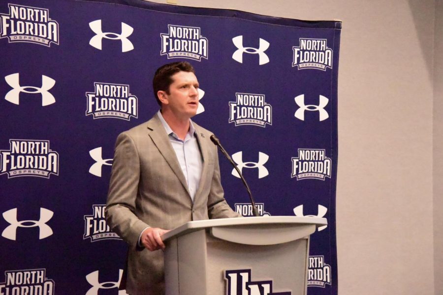
UNF Athletics updated its bird head logo, North Florida badge logo, Ospreys wordmark, and UNF arch and stacked logos that, according to athletic director Nick Morrow, “modernizes and simplifies” the athletic brand.
“UNF has a strong brand with great logos, but it is time to update many of our marks while introducing some new looks,” Morrow said to UNF athletics. “The new family of logos simplifies and modernizes our brand while maintaining the same bold look that has identified the Ospreys over the past ten years.”
One of the more noticeable changes is the updated bird head logo. The new logo includes new details, such as a “wave” shape, a nod to the River City of Jacksonville.
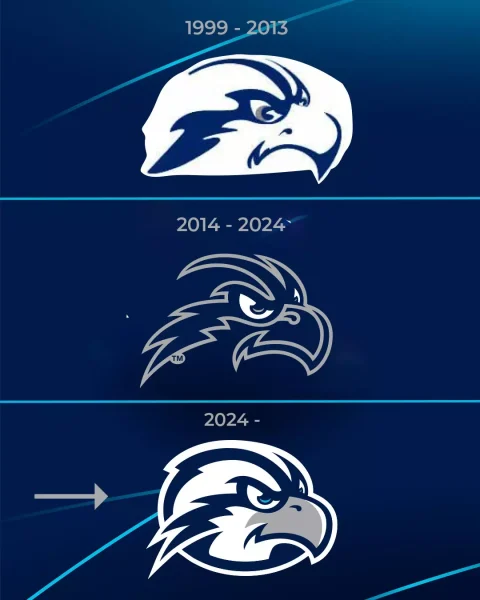
The logo change received mixed reviews from students, with most airing grievances about the birdhead.
Ametri Moss, a UNF basketball player, told Spinnaker the new Osprey logo is “smooth.”
Ryan Luke, a sophomore at UNF, said that the new bird head looks more “soft.”
“The other logo is a little more mean-looking; it would scare opponents more for me,” Luke said. “The current [logo] looks a little soft and huggable, but I see the vision.”
To Morrow, the logo updates are more of a “refresh” than anything.
“This was a refresh,” Morrow said. “A lot of our logos stayed the same.”
Morrow added that Athletics noticed a problem with the Ospreys bird head logo after working with merchandisers.
“Depending on the color of the background, it would change the color of the bird head,” Morrow said. “That shouldn’t happen; we should use the same logo and color scheme and put [the logo] on any background, and [it] should look the same.
One of Morrow’s main goals was to design a “container” around the bird’s head to solve this problem. He also acknowledged that many people liked the previous bird head while also citing the need for the change.
Athletics didn’t just update the old logos, it also introduced new ones. UNF unveiled a new “Ospreys” script logo, used for baseball and softball jerseys, according to Morrow.
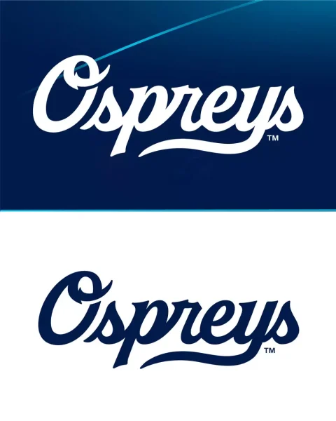
“[The script logo] has been really well received since we introduced it,” Morrow said.
According to Morrow, the logo refresh will make it easier for more companies to license UNF logos.
“Let’s have [the logo] in more stores,” Morrow said. “If you have a good solid set of [logos] it helps that cause.”
A complete list of updated UNF athletic logos can be found here.
__
For more information or news tips, or if you see an error in this story or have any compliments or concerns, contact editor@unfspinnaker.com.


