
This year marks the 50th anniversary of the University of North Florida. That’s 50 years of students, faculty, staff, and more. But there is one thing that might first come to mind when you think of UNF, or even search it online. That is the UNF logo, often called the UNF symbol. The UNF logo is designed to be the indicator and associated graphic of the university as a whole, and is what is used for UNF merchandising and publicity. The one exception is Athletics, which has its own set of logos.
But the logo hasn’t always looked like the way it does today. The UNF logo, and subsequent branding of the university itself have gone through a lot of changes over the years, so let’s travel back to the beginning, 1972 to be exact, and see what was the first iteration of the UNF logo.
Before we do that though, we must understand what the symbol is, and how it differs from the seal. You’re probably wondering, “What seal?” and if you’re just a student and haven’t graduated yet, you probably don’t even know it exists.
The UNF seal featured below, is mostly reserved for only official documentation within the university. It is copyrighted and highly restricted on where, when, and how it can be used. The most common and iconic use of it is in students’ diplomas.
The seal is primarily composed of two different parts, the circle and the compass rose. The compass rose is a reference to compasses used by sailors. A standard compass, which will point north, is an internationally iconic wayfinding device. This is similar to how the college experience offered by UNF will help students find directions in their lives during and long after college. The circle, which stands for community, is surrounded by “University of North Florida,” and “Jacksonville.” An image of the state of Florida is centered in the circle.
Interestingly, the compass rose is not centered within the circle but is positioned right where UNF can be found in the state of Florida itself. The Roman numerals on the right side, MCMLXV, stand for 1965, the year in which UNF was first charted. This seal has remained relatively unchanged since its creation and adoption, only receiving minor changes to the positioning and sizes of certain elements.
It’s important to understand the seal, as it inspired UNF’s first logo. UNF’s first logo, which was used until 1986, was essentially a simplified version of the seal, featuring just the compass rose and the circle. The logo was created under the supervision of then-president Thomas Carpenter. Unfortunately, due to the relatively brief timeframe, it was used, and the lack of simpler digital files back then, Spinnaker was unable to find a high-resolution file of it, only finding versions photocopied off of older materials.
As previously mentioned, the original logo was eventually replaced in 1986. This was due to it being often confused with the seal itself, and being vague and unoriginal. It was replaced with a newer logo featuring a large, capital “N” in a Times Roman font, with the state of Florida cleverly inscribed into the upper part of the letter, once again representing UNF’s physical location within the state.
It was designed by local graphic design firm Robin Shepherd Studios (now Shepherd Advertising Agency), with a principal design by UNF Alumni Tom Schifanella. This “N” was sometimes featured as the center of the UNF initials but was never to be used alone. It was required to be accompanied by the university wordmark, just saying “University of North Florida.” This was often accomplished by putting the “N” directly above or to the side of the wordmark.
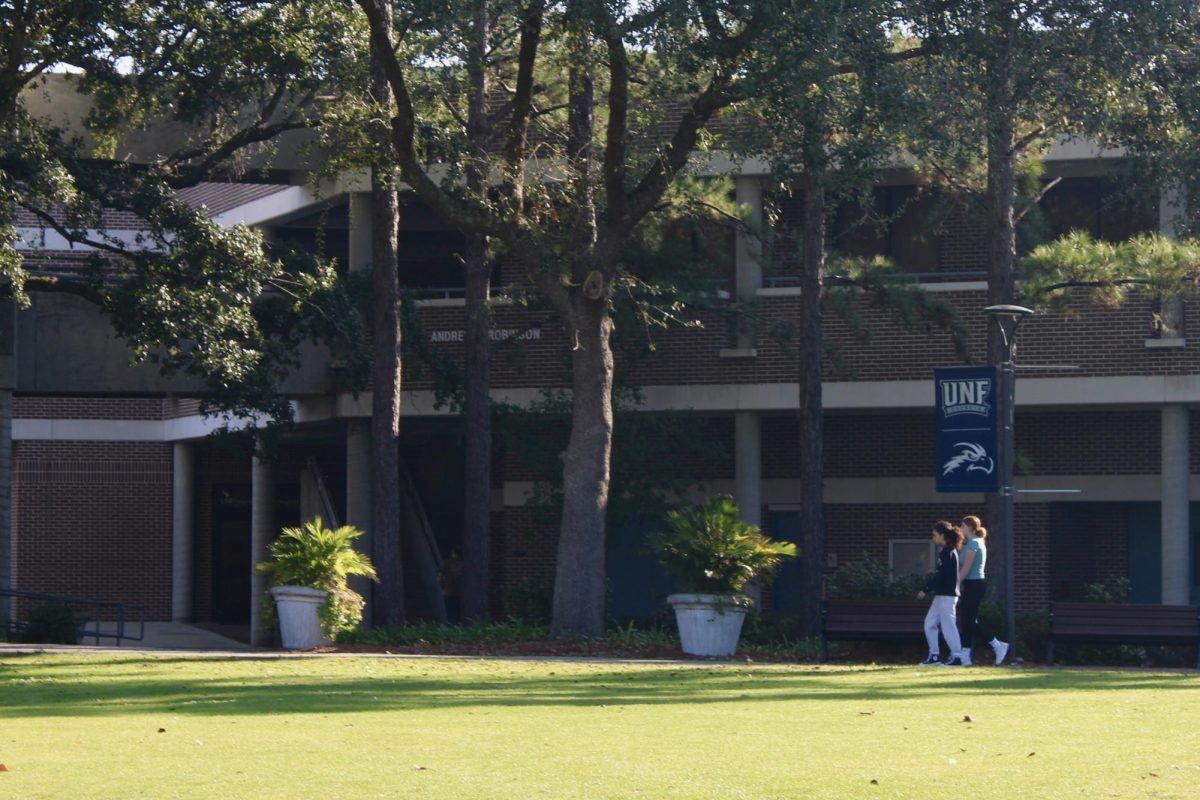
This version lasted until August of 2005 when it was replaced by the version we know today. The current version features the dark blue wordmark and the monogram initials of “UNF.” The final part of the current logo is the gray graphic of an Osprey, as the Osprey is UNF’s official mascot. The Osprey must be accompanied by either the wordmark and/or the UNF monogram initials.
The UNF logo has had quite a rich and fascinating history, and it’s very interesting to see how it has evolved over fifty years, whether the logo is a simple compass, a Florida-esque “N”, or a swooping Osprey.
___
For more information or news tips, or if you see an error in this story or have any compliments or concerns, contact [email protected].